What I enjoy most about this project is that when I look back at each post I can recall what I did on that day, it’s a journal of sorts that's nice to revisit. In September I covered a lot of ground: I spent many hours perusing the stacks at the Harold Washington Library, I traveled to Zion, Illinois and spent the weekend at the Illinois Beach State Park, I rocked out in Humboldt Park at Riot Fest, and saw Sagmeister’s Happy Show at the Chicago Cultural Center. With each place I visited, I stumbled across some form of inspiration, which was then incorporated into the day’s design.


September 1: Added some color and texture using a gelatin printmaking method. I was hoping to make some other prints to use for cards and such, but I bought a different brand of gelatin than I usually do and it started to fall apart rather quickly.


September 2: I’ve recently been introduced to cold-brewed coffee (why I didn’t know about this before, I truly do not know) and as I was prepping tomorrow’s dose of caffeination, I again noticed this wonderful packaging. It is somewhat strange, yet I have always really enjoyed it, specifically that lowercase g, so I thought I would mess with it and see what happens. I had a certain aesthetic in mind that you can see in the idea board; generally I like the original best, there’s just somthin’ about that font.

September 3: Somewhere mixed in the process yesterday, as I was searching for coffee label inspiration, I found myself fully submerged in old railroad logos. Something about that eagle didn’t quite make sense to me on espresso packaging so I think it was somewhat subconsciously looking for a new home, that said, I definitely like the simply typographic marks better.

September 4: An idea for a ticket using some of yesterday’s logos. The layout doesn’t feel fully resolved yet and I want to incorporate some sort of stamped or punched element to it.

September 5: Searched for more ticket inspiration and created a layout that seems much more suited to the railroad theme I’ve been riding the past few days. I really like how the cents are treated, I spotted this while searching for ideas and find it to be quite clever.
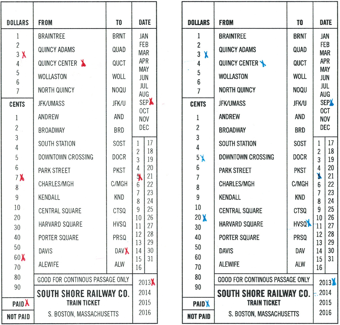

September 6: Finally bought some colored ink pads to experiment with, but I think like the punched version better.


September 7: Went to the Harold Washington Library and let myself get totally lost in the stacks. I was looking for books on flowers, botany, vegetables etc. with a certain style of illustration. I had done a little searching on the internet, but had this vision in my head of what I was looking for and just needed to peruse some books. I had a general idea of where to start, but mostly just wondered around, judging the books by their covers, and eventually found what I was looking for.
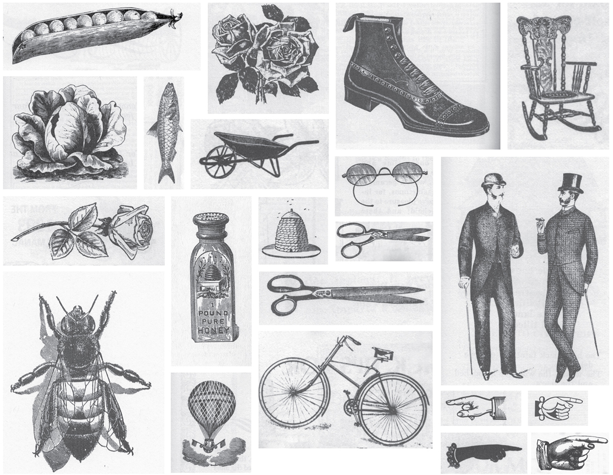
September 8: Some more library illustration finds. I checked out a few books on farming that had these awesome illustrations within. I scanned my favorites and am now thinking about where they should live next.

September 9: Playing around with some of the images I scanned yesterday and searching for a way to repurpose them. I was working with a few different font and image combos, but this one seems to be holding together best.

September 10: I am going to call this a Layered Typographic Illustration; I don’t know what this design aesthetic is actually called, but I have seen several images of this nature and wanted to play too. This is what I had in mind when I was searching for books at the library the other day. I thought this would be the perfect way to send my love to my pal Siggy on her birthday.

September 11: Another Layered Typographic Illustration. I like how it adds some dimension to an otherwise flat object.

September 12: Something I saw prompted a thought about flash cards, so I made a few of my own.

September 13: Brushing up on my math skills.

September 14: Overwhelmed by the food options at Riot Fest. Rows of tightly packed booths with tacky vinyl signs adorned with unappealing photos of greasy food and terrible typography and then this beauty sung out.

September 15: I spent the weekend at Riot Fest enjoying some music. They did a really nice job creating an identity for the event, the font choices and old carnival imagery were appreciated. I spent some time today looking up old carnival posters and such and ended up sketching out this poster listing all of the bands I saw.


September 16: Finally went to check out Sagmeister’s Happy Show and it was even cooler than expected. When asked what my symbol of happiness is, I immediately thought: pencil.


September 17: Inspired by the vintage circus design of Riot Fest, I did some library perusing and found these awesome books of old circus poster and such. Simply put, the illustrations and typography are amazing and I am exploding with ideas.

September 18: Just starting to play around with elements from the circus books. I scanned and cut out this woman and tiger, then experimented with a few different fonts. This composition definitely needs some work, but I now have a better idea of where I’m heading.

September 19: I thought I had it when I decided to use this banner for the text, but the typography just doesn’t hold up as well as the beautiful hand drawn examples in the books. I think I need to break away from the originals and think about the information in a totally new way.


September 20: Staying up at the Illinois Beach State Park for the weekend and came across this cool retro building. Really diggin’ how the shapes are carried throughout the building.


September 21: Spotted some awesome signs and weathered typography while exploring northern Illinois and Wisconsin today.
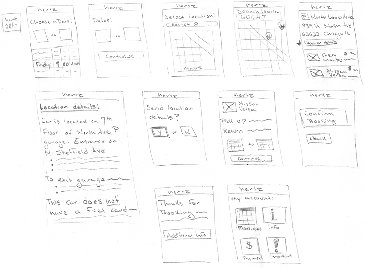
September 22: I had a terrible experience this weekend renting a car using Hertz 24/7. Crucial information was not communicated and major user experience issues were noted. When selecting a pick-up location, no details were provided, an address had been listed, but there were no notes indicating where within the parking garage one would find the car, nor was information provided about exiting garage payment. I ran into many issues while renting a car with this program, most of which could have been avoided had proper communication occurred. I have drawn out a wireframe including features I think would greatly improve this service, however after the experience I had this weekend, I can confidently say that I will not be using this program again.

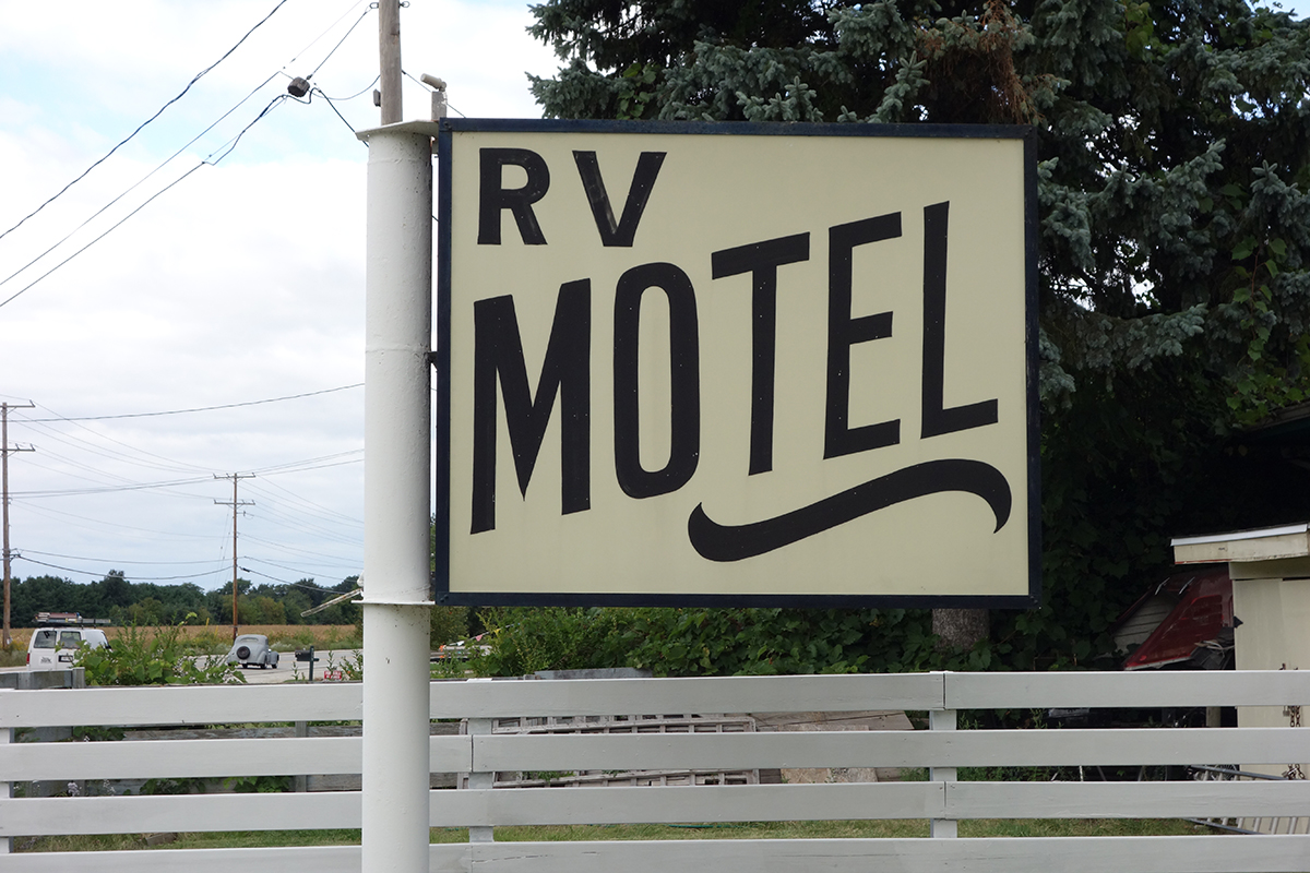
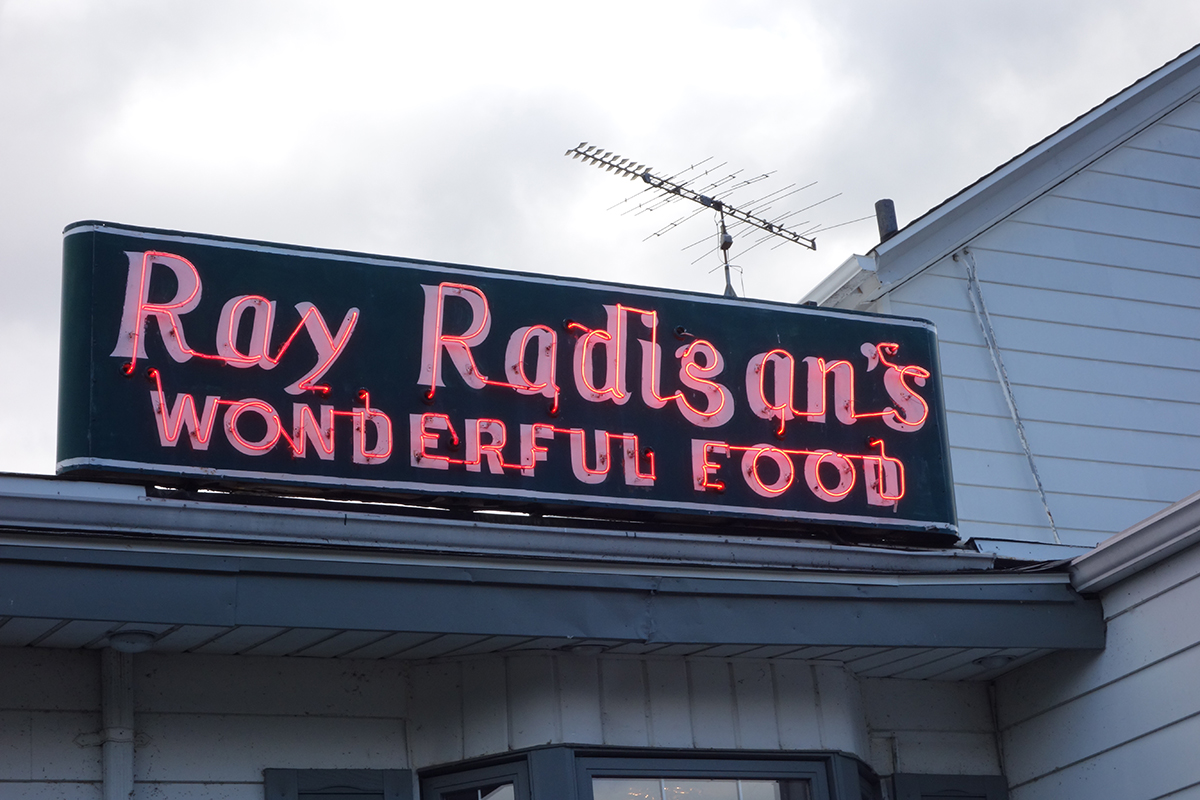
September 23: Spotted a sign with this name on it while in Zion over the weekend. I like the alliteration and I love a good Uppercase R, so I thought I would doodle a few new logo concepts.

September 24: Quickly sketched out yesterday’s logo doodles using a variety of sans fonts.

September 25: Still messing around with some logo concepts for this restaurant. I am diggin’ the diagonal element, but I don’t think the composition has been fully resolved yet.

September 26: Tweaked the logo a bit and am starting to think about its application. I just grabbed this image of a fork and knife off the web, but this idea of incorporating a photographed isolated object is something that I’ve had in my ‘Idea Folder’ for a while now.

September 27: Working on a menu and starting to apply the design elements across other pieces. I like how the logo holds up without the other information and how the diagonal line element can be used throughout.

September 28: Started to think about how I’d like the website to look and Billy Sunday’s site immediately came to mind. (http://billy-sunday.com/beer-wine/) I borrowed a few elements from it to pair with the identity I have begun to establish and it seems to be working well.

September 29: I imagine that the website would be responsive and translate well on mobile devices. One of my favorite aspects of my Squarespace portfolio site is how it collapses the tabs when viewing in a small window, thus I thought the same should be applied to this site.

September 30: Still working on this identity; here’s a guest check receipt.